Notice:
The advice given on this site is based upon individual or quoted experience, yours may differ.
The Officers, Staff and members of this site only provide information based upon the concept that anyone utilizing this information does so at their own risk and holds harmless all contributors to this site.
I am contemplating adding the boat name to the sides or back of <i>Mast Confusion.</i> I am having a difficult time deciding which route to go, sides/back, and what size letters. Can you folks help me out with pics of your graphics and the size lettering you used? I will probably be using BoatUS graphics....any pros/cons? Thanks.
"Mast Confusion" 1983 SK, #3525 Ken Hampton Roads, Va
Sides: 6" caps, 4" lower case. You have a lot of letters. It will probably cover most of the length of the cockpit. To fit on the transom, you would have to stack the words and the letters would be too small to read from a distance.
That was my concern for the stern...I am more inclined to have them on the side. I had thought about the "Mast" being at a 45 degree angle to the word "Confusion"
When I purchased my graphisc from Boat US for the sides of the hull....the second side is generally at a lower cost...for ordering two. You may find that you are considering the transom since it would be less expensive only having to make up the name with one grapic. Well, that is true but the hull sides makes for your name much more easily read by other boters when out sailing and you may find other graphic departments will also provide the second graphic at much less than double the cost of one. I have not ordered a raphic in over 7 years, so i do not know if this is still the common practice but if cost is one of your considerations, I would check out the cost of one vs having a two graphics made to see what the total cost would be.
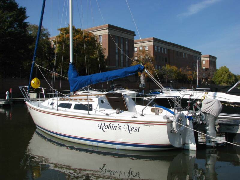
We installed on the hull sides: Supported our local graphics shop, (we try to support local businesses when we can) which worked nicely. Tom offered a suggestion I hadn't thought of which turned out great. Basically, the font has an outline then shadow. It was 40 for both sides (two colors in 6in letters) and later did the lifering for 12.(he threw in a spare set)
The Boat US Graphics store is actually local for me as the Boat US Headquarters is located in Northern VA. When the Boat US store changed into a West Marine store, they had a sliding service window to access the Boat US Graphics Dept. While the Boat US Graphics dept still exists, they closed the West Marine store a number of years ago since they had another West Marine store in the area - Old Town/Alexandria, VA.
There are benefits to supporting your local graphics stores, if you have a local graphics store. First, you can always go back and get a strip of repair material if you ever have to repair a letter as I had to several years ago. Boat US had my name on file and was able to cut me a 1 foot strip of the same color match and they did not charge me for the material. (The repair of one of the letters after having it smudged by my finger slip rail was an exact match in color since the original lettering had not faded in all the years I have owned my boat.) Second, when placing your order, contacting them directly after or at time of electronically ordering, they can assist you with the font/letter size and overall length of your boat name graphic. In my case, they called me shortly after I had placed my order electronically and explained that my specific font had long tails on the capital letters that greatly increased the overall font size (ie. an 8" letter was actually more like a 10" or greater letter height). They also helped me with the overall length of the name offering to adjust the spacing to my liking. So there are some extra benefits that one can derive with some direct assistance rather than solely relying on the electronic ordering.
My recommendation is that many undersize their boat names and the boat name is then not so visible from a distance when out sailing. I know that my boat name is easily seen from a distance as I have had friends located way down the Potomac River happening to have seen me from a distance because my boat name was so visible.
If you want to experiment you can buy your own vinyl cutter for not too much money and play with making your own graphics. I use a Cameo Silhoutte which cuts up to 12" tall material. I use Oracal 751 or 951 vinyl (sadly hard to find in 12" widths) for vinyl on the boat.
I prefer having the boat name only on the transom, but the C-25 transom is quite cluttered between the ladder, outboard, and transom hung rudder. That probably makes labeling the side the way to go for any longer name.
This is what our C-25 looked like with home-cut vinyl on the transom:
If I remember correctly that was done on a piece of 12" x 18" vinyl.
"Lutra" is quite a short name though, so it's easy to fit. The ladder still obscures it a bit when folded up.
Our new boat has a spade rudder and inboard, so the transom is a lot cleaner and more open. I just need to decide on a name...
I'm in the bigger is better camp for a number of reasons. Easier to communicate which could sometimes be considered a safety thing. And should your vessel ever be stolen or breaks free from a mooring, it hopefully will be easier to recover. SV Lysistrata has her name amidships as opposed to aft. I like that idea now too. And no squiggly crap I can't freaking read, Please!? Letters on the stern are helpful, and a hailing port is cool, but really only a documented vessel thing. I found it difficult to find a way to put a decent sized graphic on the stern on my C25, but that is an important place to put the name of your vessel.
I once saw a 24' Canadian flagged vessel that had canvas wind blocker things on the lifelines all the way around the cockpit, with huge white letters sewn onto the blue canvas. Looked cool and very salty.
Bottom line, the graphics aren't for you. You can't see them, right?
<blockquote id="quote"><font size="1" face="Verdana, Arial, Helvetica" id="quote">quote:<hr height="1" noshade id="quote"><i>Originally posted by delliottg</i> <br />I go back & forth on whether our lettering is too big in SL:
<hr height="1" noshade id="quote"></font id="quote"></blockquote id="quote"> Looks good to me.
<blockquote id="quote"><font size="1" face="Verdana, Arial, Helvetica" id="quote">quote:<hr height="1" noshade id="quote"><i>Originally posted by delliottg</i> <br />I go back & forth on whether our lettering is too big in SL:
Binky I would suggest the word Mast being verticle and confusion be a JUMBLE of letters in various degrees of angles or fonts.. also Go Large on the sides.. " ABOUT TIME " ( My boat) was painted on Years ago?? Coming into a new marina , a woman sitting on the beach shouted out to us , well its "ABOUT Time" and we laughed and said you are so right. No picture available.
Ken, As a paid member I am sure you took advantage and joined BoatUS for the discounted rate of $15. This will allow you to a 10% discount on lettering. My 2cents, bigger better. Mine could have been a tag size larger. Steve A
I was am member of BoatUS before joining here, I will take advantage of discount rate on renewal. I will grab the graphics rate if I decide what size/color combo I want on graphics.
<blockquote id="quote"><font size="1" face="Verdana, Arial, Helvetica" id="quote">quote:<hr height="1" noshade id="quote"><i>Originally posted by Frank Law</i> <br />Binky I would suggest the word Mast being verticle and confusion be a JUMBLE of letters in various degrees of angles or fonts.. also Go Large on the sides.. " ABOUT TIME " ( My boat) was painted on Years ago?? Coming into a new marina , a woman sitting on the beach shouted out to us , well its "ABOUT Time" and we laughed and said you are so right. No picture available.
Frank Law " ABOUT TIME " # 3519 1983 SWK , SR <hr height="1" noshade id="quote"></font id="quote"></blockquote id="quote">
Please don't do that. Boat names can be clever, I guess, if you must, but please make it something I can read while bouncing around and using binnoculars.
A Shark in our club is named Mickey, his graphics are wrapped around the transom and into the aft quarters. It looks good and is surprisingly readable.
<blockquote id="quote"><font size="1" face="Verdana, Arial, Helvetica" id="quote">quote:<hr height="1" noshade id="quote"><i>Originally posted by redviking</i> <br />I'm in the bigger is better camp for a number of reasons. Easier to communicate which could sometimes be considered a safety thing. ... no squiggly crap I can't freaking read, ... Bottom line, the graphics aren't for you. You can't see them, right?
Totally agreed. How many times do you see a boat arriving at an anchorage and the name is too small or too scripted to read.
We were at an anchorage one evening, several boats around and saw the dink drift away from one, obviously empty, they were oblivious to the the problem. I called on #72 'This is Joint Decision, Any sailboat near Sands Key should Check your dink, someone is loosing theirs. Had I known the boat name I would have hailed them on 16 as well. We saw them climb out to the cockpit and see their dink about 50' away. One jumped in and swam to it. Watching the guy try to get into the dink was almost funny. Upon recovery, they hailed us with thanks.
Make the name readable.
One boat in our area has the name Wilim, I asked the background to the name as it was obviously not a racing boat. It was named so that it read the same when inverted!
The best place to buy graphics (IMHO) is American graphics - they are franchised all over the Country. I just bought 2 decals, 3' long with 11 letters varying from 6" high to 3" high. Cost was $20.35
Notice: The advice given on this site is based upon individual or quoted experience, yours may differ. The Officers, Staff and members of this site only provide information based upon the concept that anyone utilizing this information does so at their own risk and holds harmless all contributors to this site.